Mollier Diagram
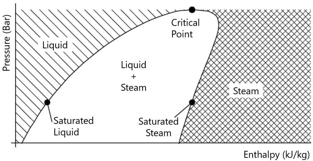
The Mollier Diagram is a visual tool used in thermodynamics to represent the performance of a fluid throughout its cooling and heating cycle. It was developed by the German engineer Richard Mollier in 1903 and is an effective way to visualise the relationship between Enthalpy, Pressure, Temperature…, of a refrigerant gas, so this table is also known as “P-h table” or “pressure-enthalpy table”.
Basically the diagram is composed of two main axes and three zones delimited by a saturation curve.
- The absolute pressure value in (bar) -for Ph diagrams in SI- is recorded on the ordinate axis, graduated axis in logarithmic scale.
- On the x-axis the enthalpy value per unit mass is recorded in [kJ/kg] or [kcal/kg].

The Mollier Diagram is useful because it allows us to visualise and compare different refrigeration and heating cycles. For example, we can compare the refrigeration cycle of one refrigerant with the refrigeration cycle of another refrigerant to determine which is more efficient. It also helps us to evaluate the efficiency of a refrigeration or heating cycle in terms of the amount of energy required to move the fluid through the cycle.
In the HVAC sector, it is essential to know and use this diagram as it is necessary in the design of air conditioning systems, seeking to optimise the performance of the equipment itself. For example, it is used to determine the best evaporator and condenser within a system, and to select the most suitable compressor type for your application. It can also be used to determine the amount of refrigerant required for a system, and to assess the energy efficiency of the system as a whole.
You can learn more about this topic in our book “Refrigerant Gases and Mollier Diagram“:
More articles
Interested in other (technical) knowledge articles? Keep yourself up to date and read them all


